StandOut Pre-Assessment
This is a test. This is only a test...
(UI Design / Illustrations / Prototypes / User Acceptance Testing)
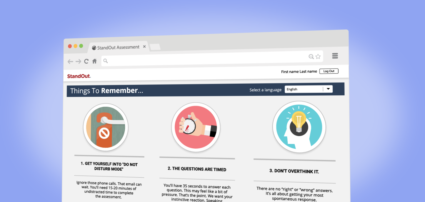
The StandOut Pre-Assessment screen serves as the gateway into the StandOut platform and in many respects is the most important opportunity to make a lasting impression with its users. It had to embody the product's core attributes... hardworking, fun and educational. After a few rounds of user testing the existing Pre-Assessment screen, it was clear a change was needed as it was not at all representative of the adventure and exploration that lay ahead of the user.
The Opportunity
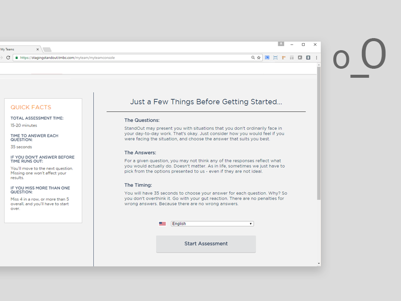
Client feedback, later bolstered by several rounds of user testing, created an awareness around some issues that plagued the Pre-Assessment page and persisted into the assessment itself. Most in need of an overhaul were a CTA button that was often mistaken as being in a disabled state, a 'Quick Facts' section that felt like an afterthought and an overall drabness to the page that was, as one participant put it, "oft-putting". My personal peeve was the popover modal that was prompted once the 'Start Assessment' button was pressed, to simply reiterate the information on the 'Quick Facts' section. That one in particular drew attention to the fact that it was a band-aid.
The Approach
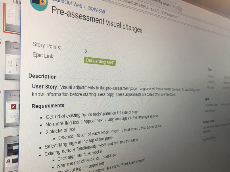
At this point, the client was in the driver's seat, and my team and I were along for the ride. We were extremely fortunate that they knew what they were doing. At the time, they were our one and only global client, crucial to the survival of the company (without exaggeration). They decided that there should only be three blocks of text that would incorporate icons as well as the 'Quick Facts' section, and, in my personal favorite piece of client feedback, stated that we needed to get rid of the modal that was prompted when the user tried to start the assessment.
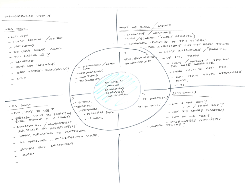
I usually start brainstorming with a modified SWOT analysis, wherein I try to think through as many possible use cases as I can. I have found that this usually gives my thought process some semblance of structure even at this stage. So that when I finally pick up my Copic markers I feel confident that I can bring my 'A' game.
“At the time, they were our one and only global client, crucial to the survival of the company...”
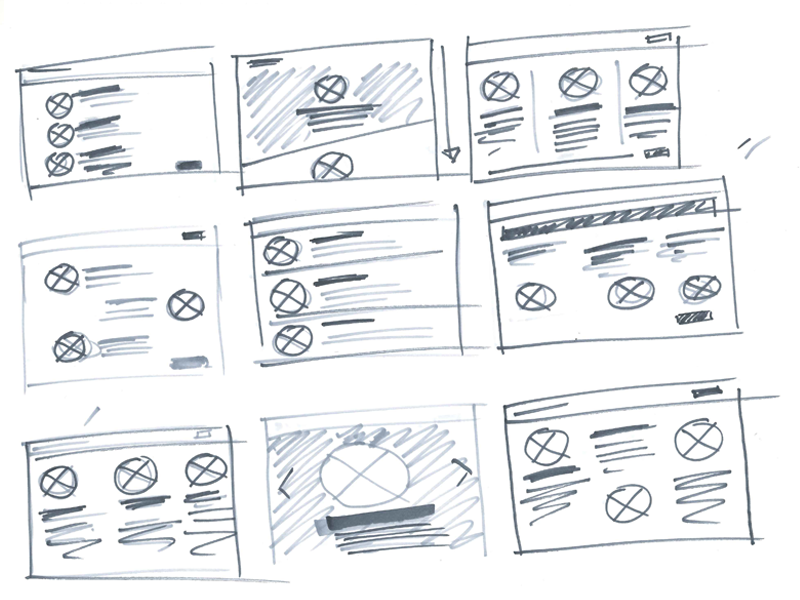
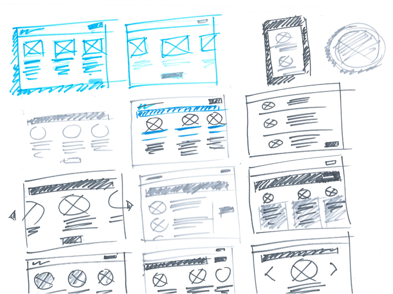
This has got to be the best part of my working day... me, my sketch pad and a great playlist.
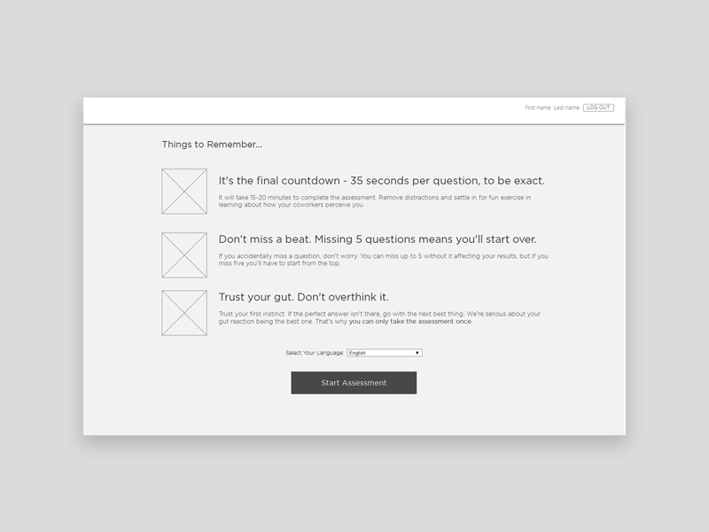
I love having sketches ready to help along the wireframes, my UX Designer always appreciated this as it helped us see where we were aligned, and more importantly where we weren't. Now all that's left is to do is breath life into the wireframes. Homestrech...almost.
“ It had to embody the products core attributes... hardworking, fun, and educational.”
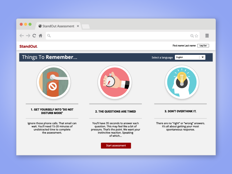
I think this feels a lot friendlier, while still being firm in its message of what to expect.
The Solution
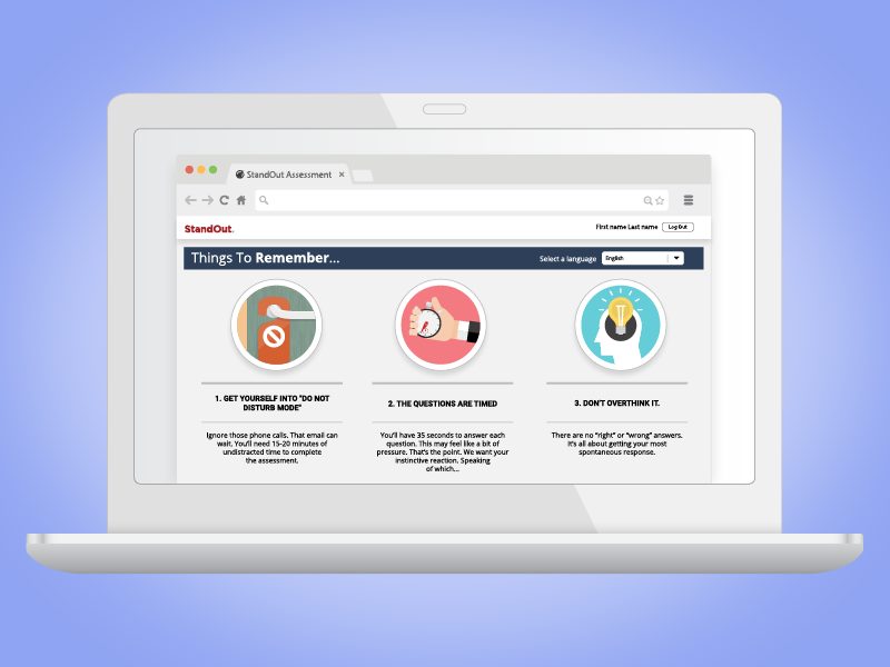
We hit all our requirements.. We nixed the 'Quick Facts' section, got rid of the modal that asked if you were sure that you wanted to move forward, and obliterated the drabness completely. I even got to make some illustrations. The client loved this, and when I showed it to people around the office, the reaction was usually a big smile. We put the fun back in this page and had fun doing it. Great way to start a relationship with our first global client.
More Case Studies