Dynamic Actions
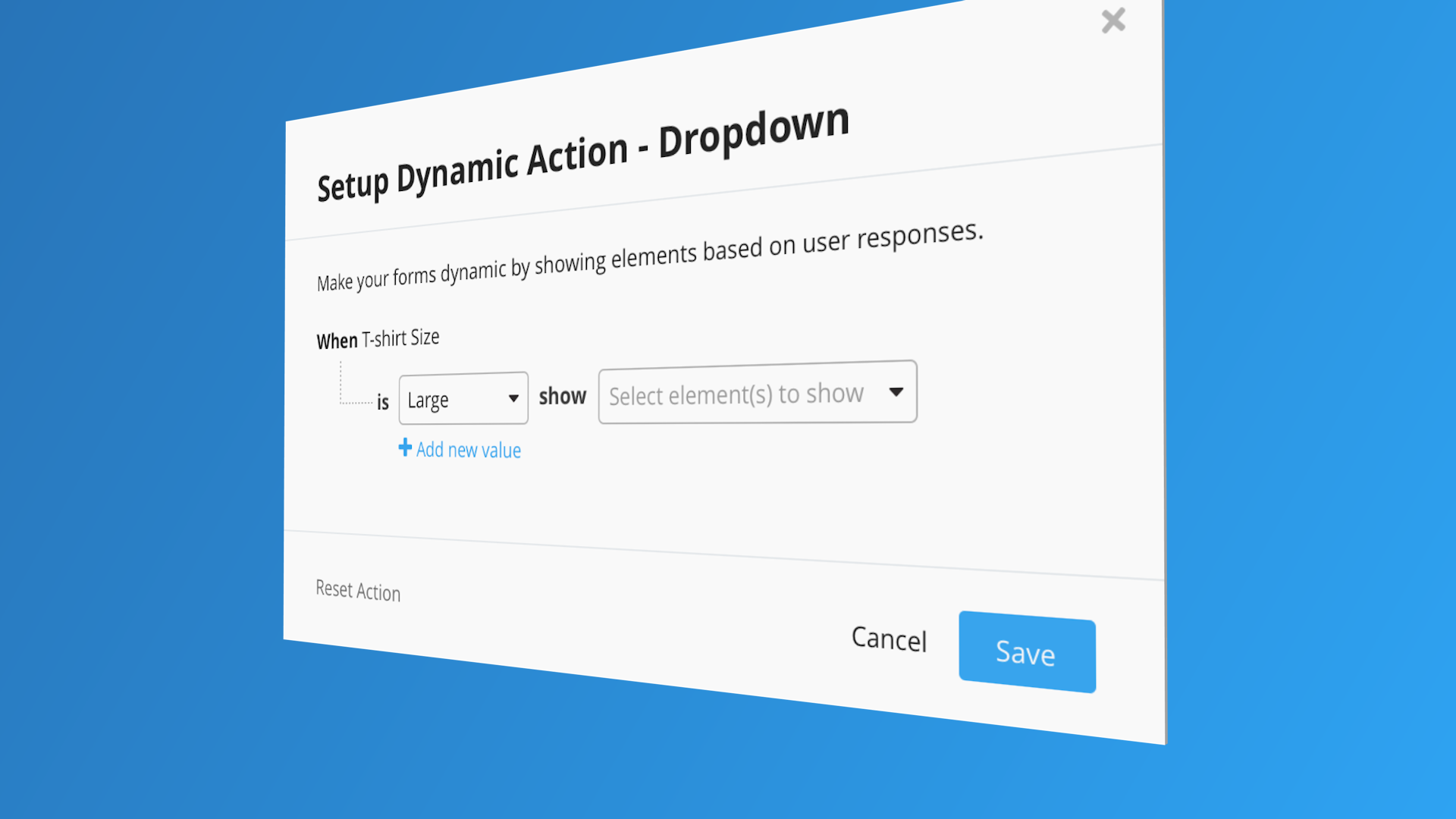
How might we enable fundraisers to incorporate conditional logic into their forms and increase conversion rates?
UX + UI • Copywriting • Prototyping • User Testing • User Acceptance Testing
This was a two month-long project where a team consisting a product manager, 5 engineers and a ux designer (me) were tasked with adding conditional logic to MobileCause’s form builder. The feature set was shipped in Late 2018. This case study is an overview of how that was accomplished.
The Challenge
The challenge seemed straightforward, add conditional logic to our forms, so as to keep in step with what similar products in our space were already offering. So far so good, the only hitch being that the delivery of this feature was promised to a client in a last ditch effort to keep their business. Put simply, we would be in a bit of a time crunch and we would have to design, test and build with agility in mind at all times.
Initial Explorations & Research
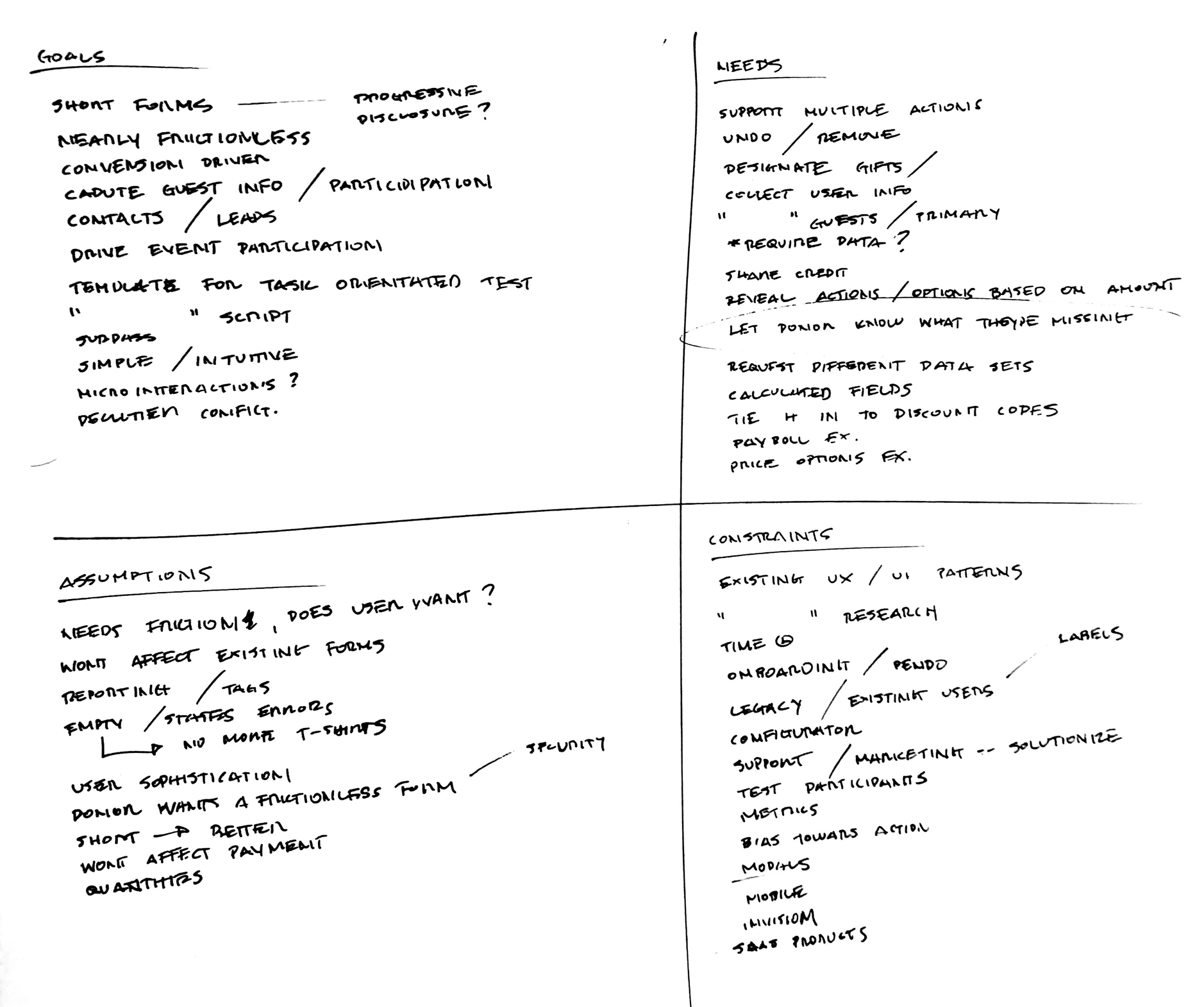
Although every project is different, I usually like to start with a brainstorm session that I am able to distill into a modified SWOT analysis. It helps give some semblance of structure to my initial impressions of the challenge(s) at hand. It also gives me a point of reference when I get too far down in the weeds.
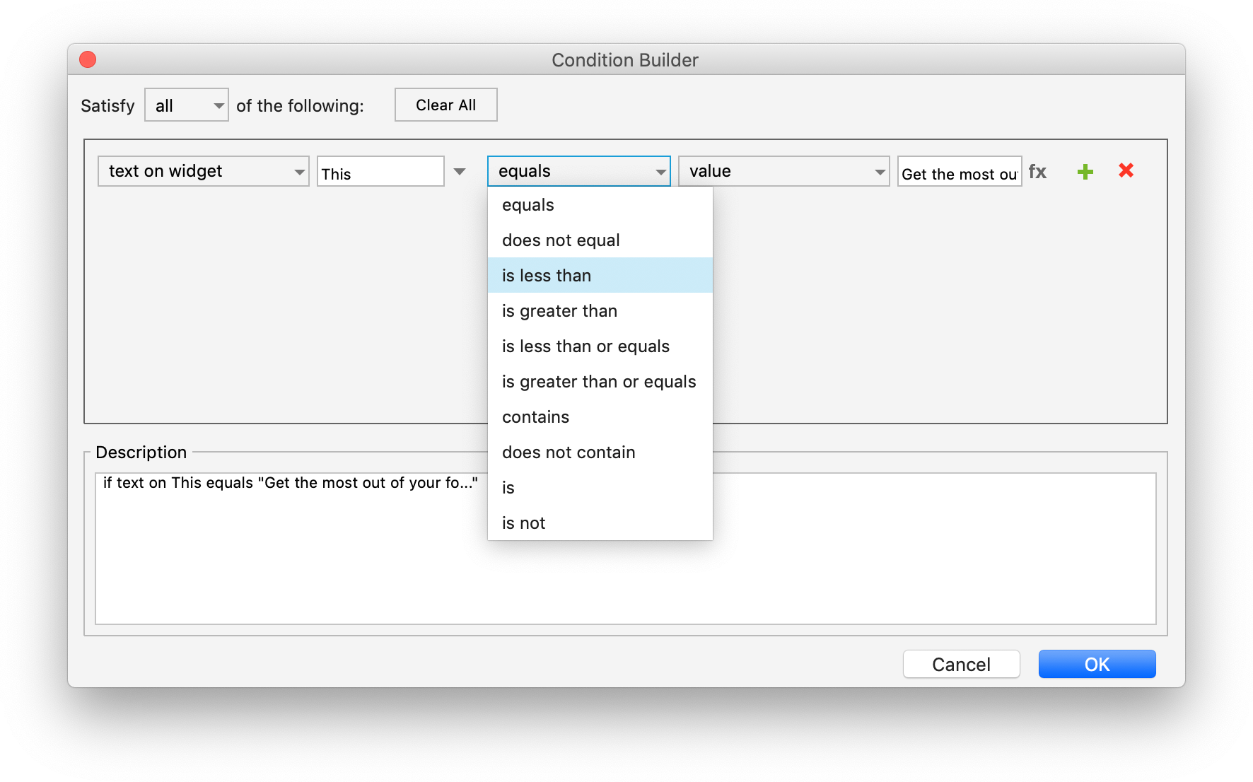
Analysis of form building software both directly and indirectly in our product’s space gave me a strong sense of common design patterns that our user base would be familiar with. Axure’s is a good example of a “Condition Builder” that was not directly in our product space but sparked some ideas around letting the user “build” a coherent statement to accomplish their task.
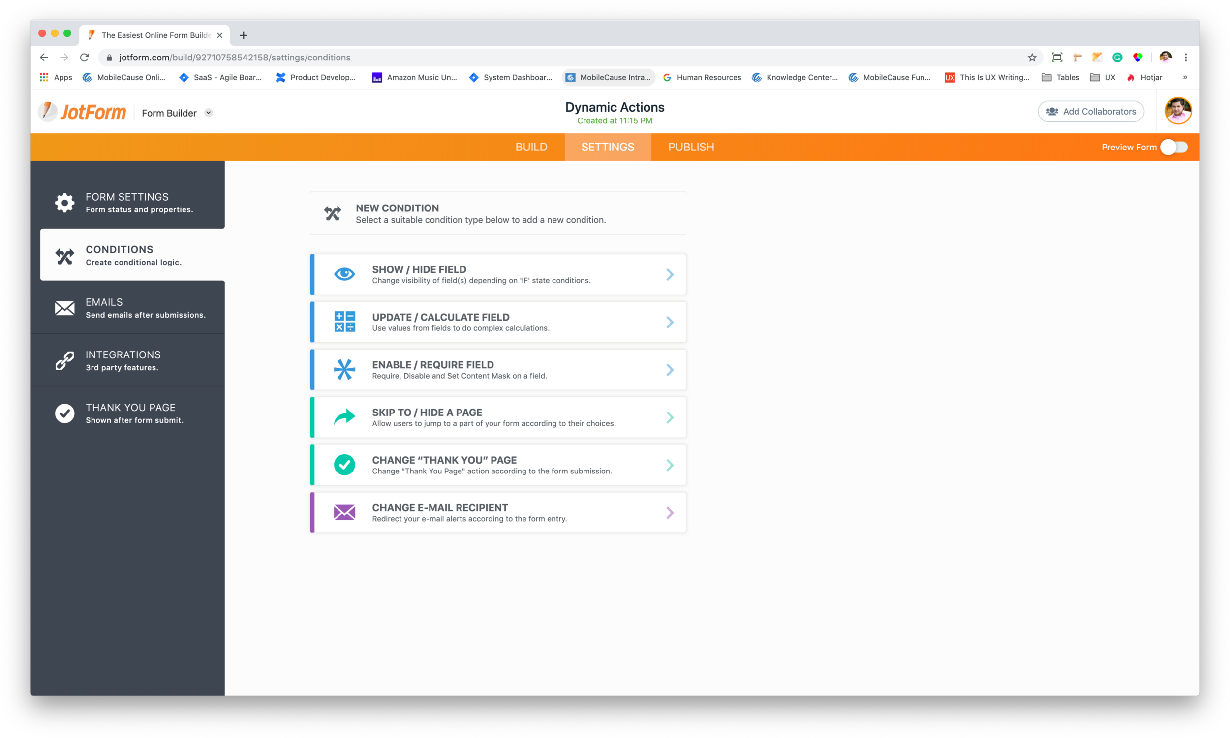
JotForm’s bold and colorful graphic approach to building forms lended itself to a much friendlier user interface.
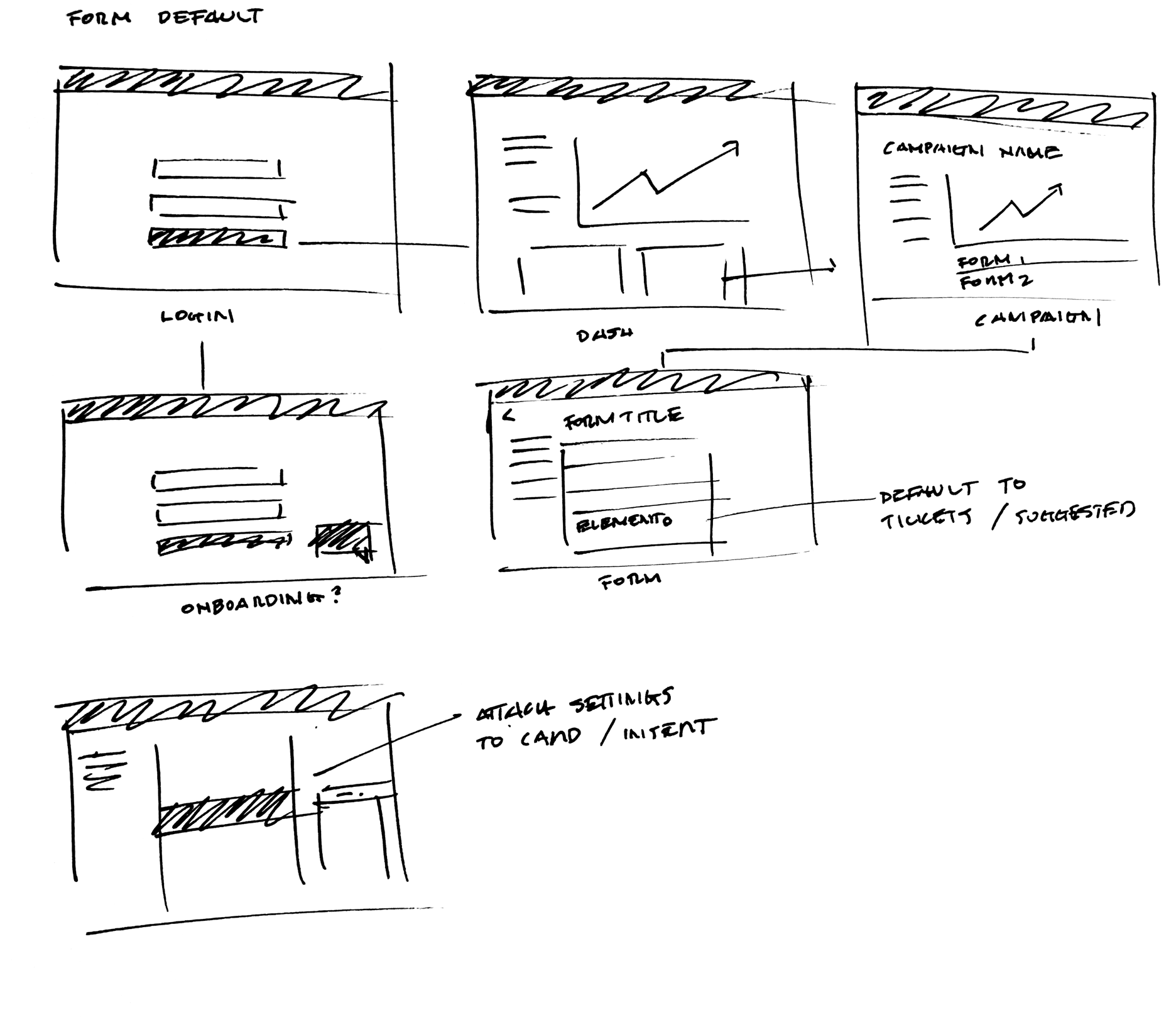
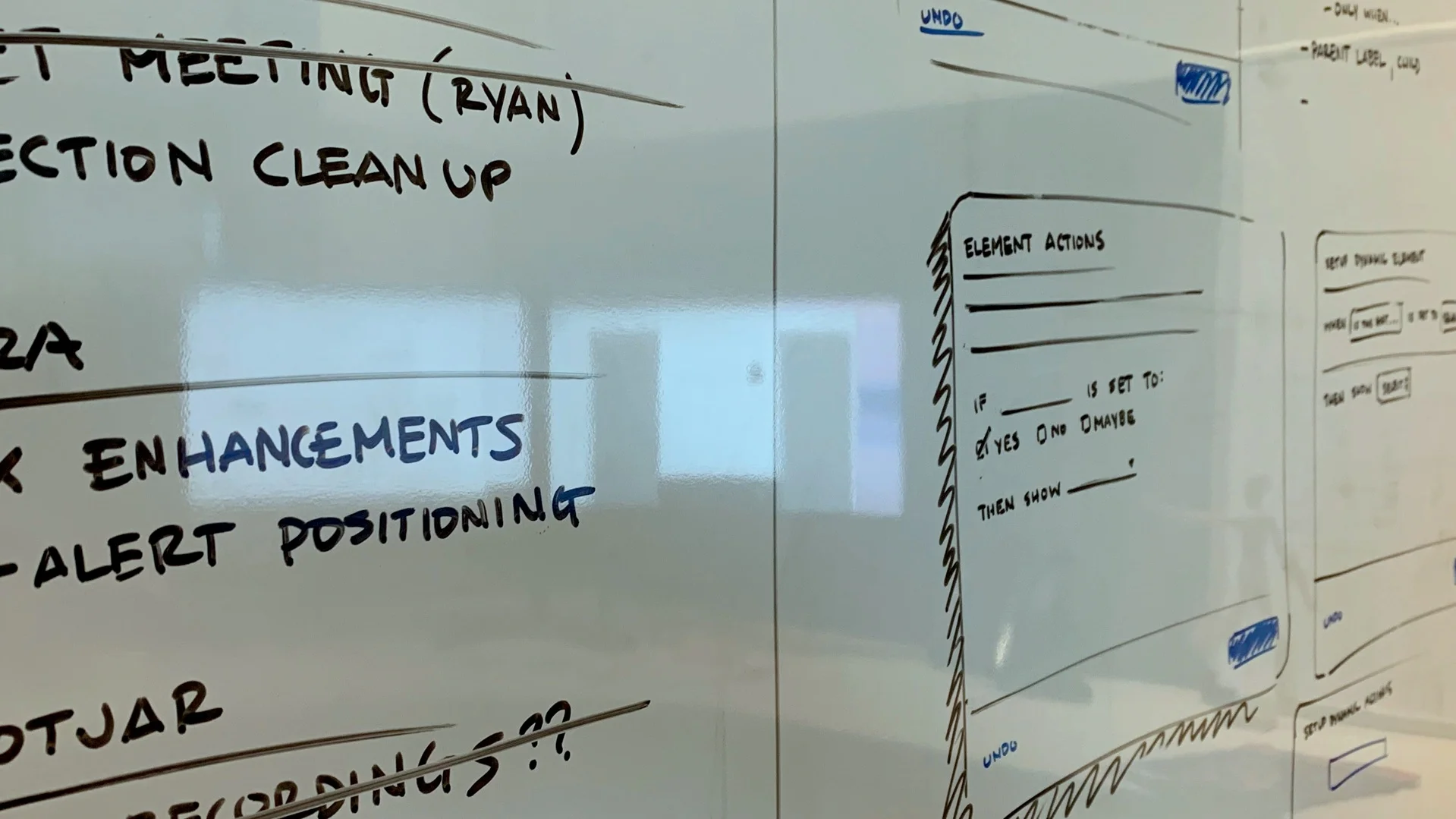
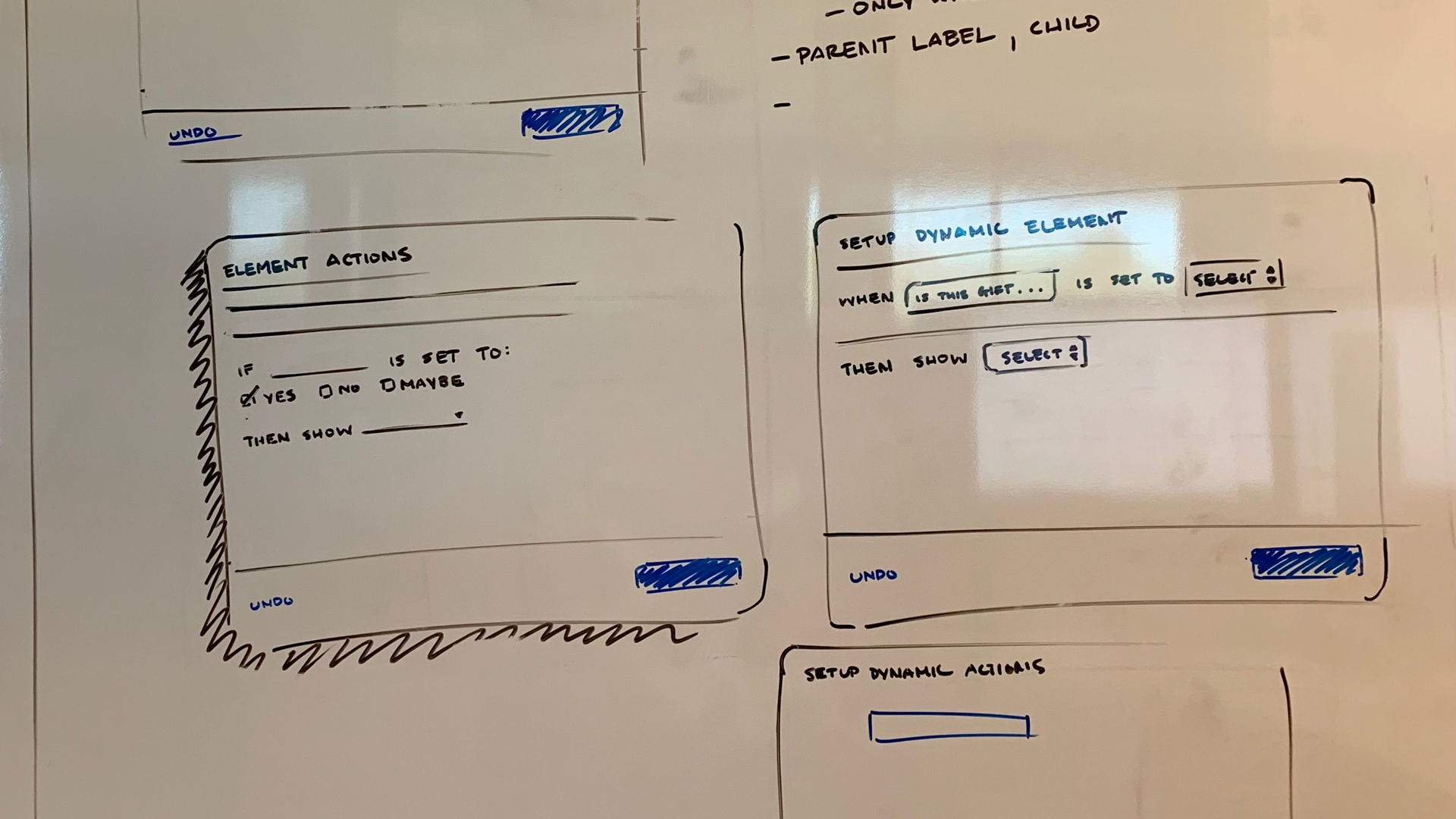
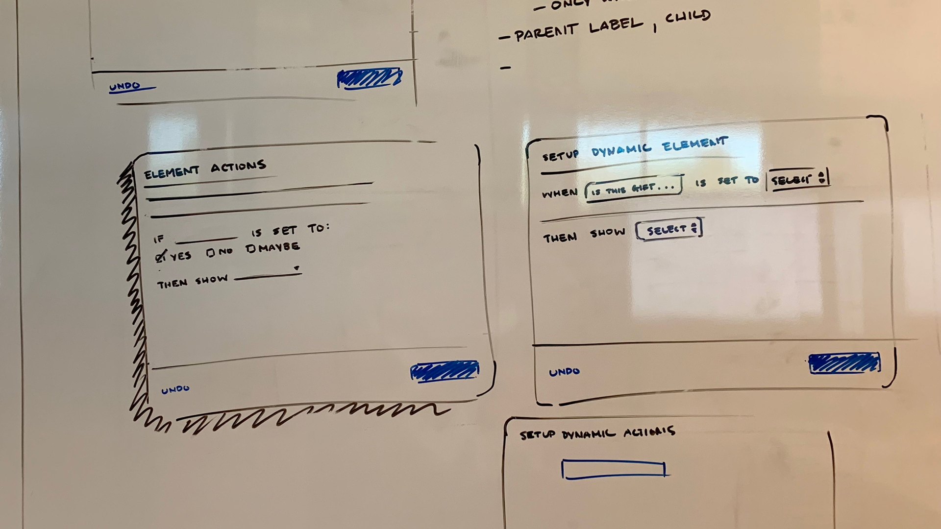
I have to admit I love sketching and whiteboarding ideas, in part because I love drawing (I grew up reading comics). Mostly, I love these types of visualizations because they quickly give you a sense of which concepts may or may not work. Moreover they can clue you in as to where you might encounter problems with your design solutions.
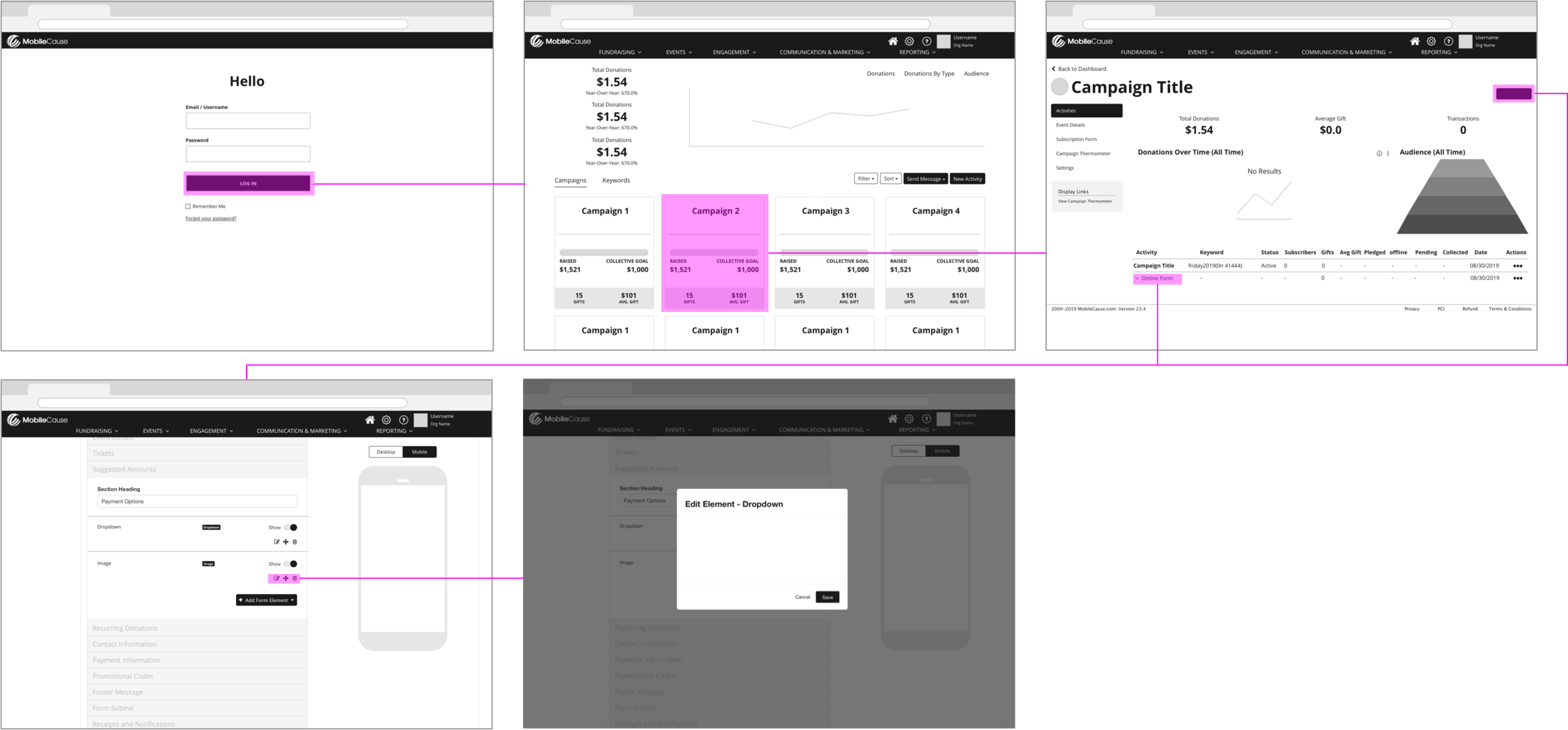
Existing design patterns, had conditioned users to build forms a certain way. Namely, by adding, removing and positioning sections then customizing elements within those those sections to suit their fundraising needs. Moreover, the settings for these sections and form elements are housed within corresponding modals. That said, designing with respect to existing design and usability patterns would be crucial to the success of this project.
““Deciding what not to do is as important as deciding what to do.”
- Steve Jobs”
Defining Scope
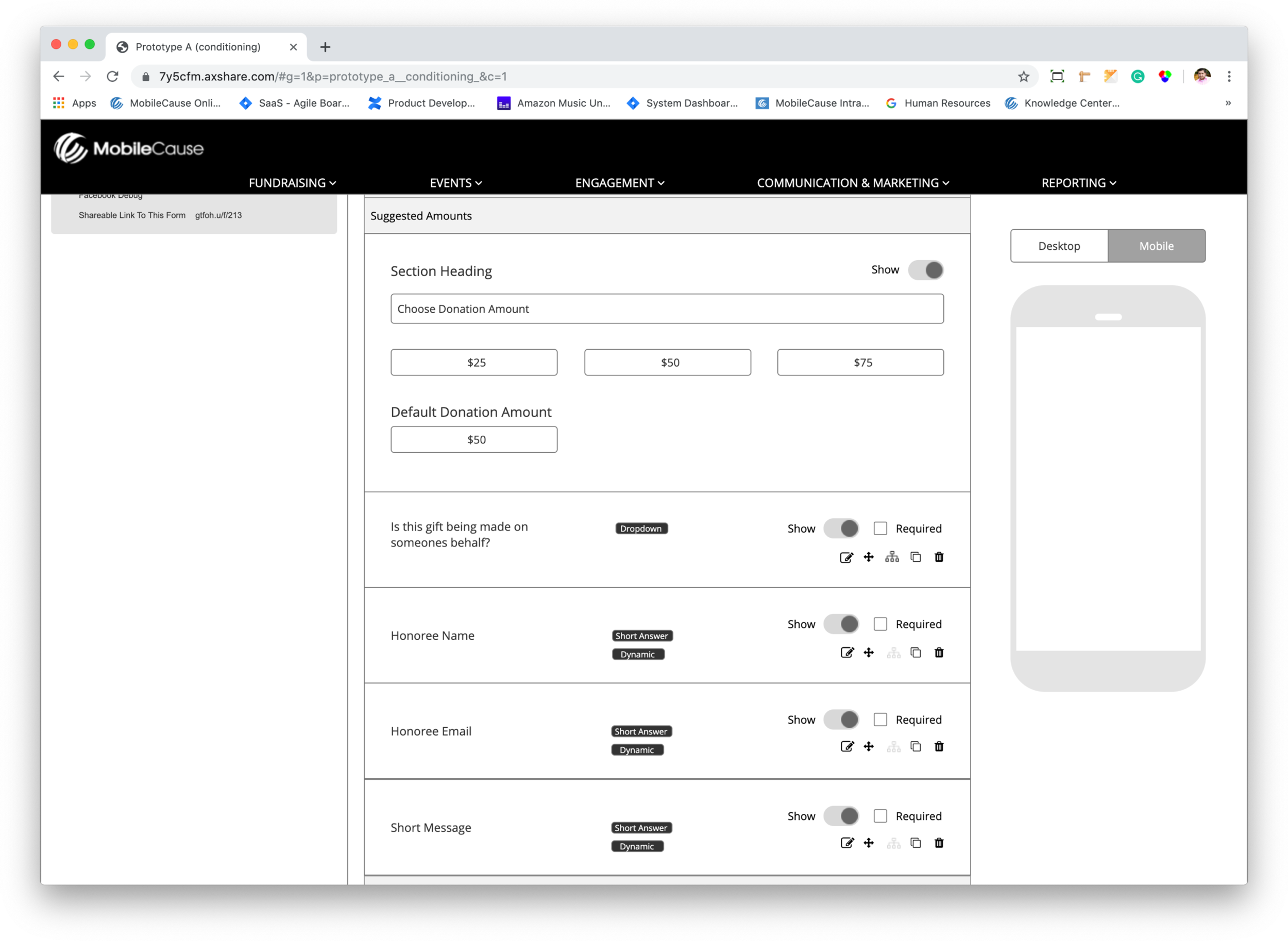
My initial research and explorations gave me the knowledge base needed to begin narrowing scope, prioritizing challenges, and deciding which direction to tackle first. As a designer, this can be tough given that you’d like to solve everything for everybody, everywhere. To help us decide, we engaged our user base by developing realistic scenarios, encouraged them to act, all while not giving away how the interface should be used.
The Feedback
We had our user rank the prototypes based on ease of use, value add, and familiarity. The results were unanimous prototype A was the clear winner. We now had the blueprint, to start building a robust feature that our clients could easily pickup and use. This is usually a good place to refine the direction while paying extra close attention to aesthetics, it was time to iterate, iterate, and iterate.
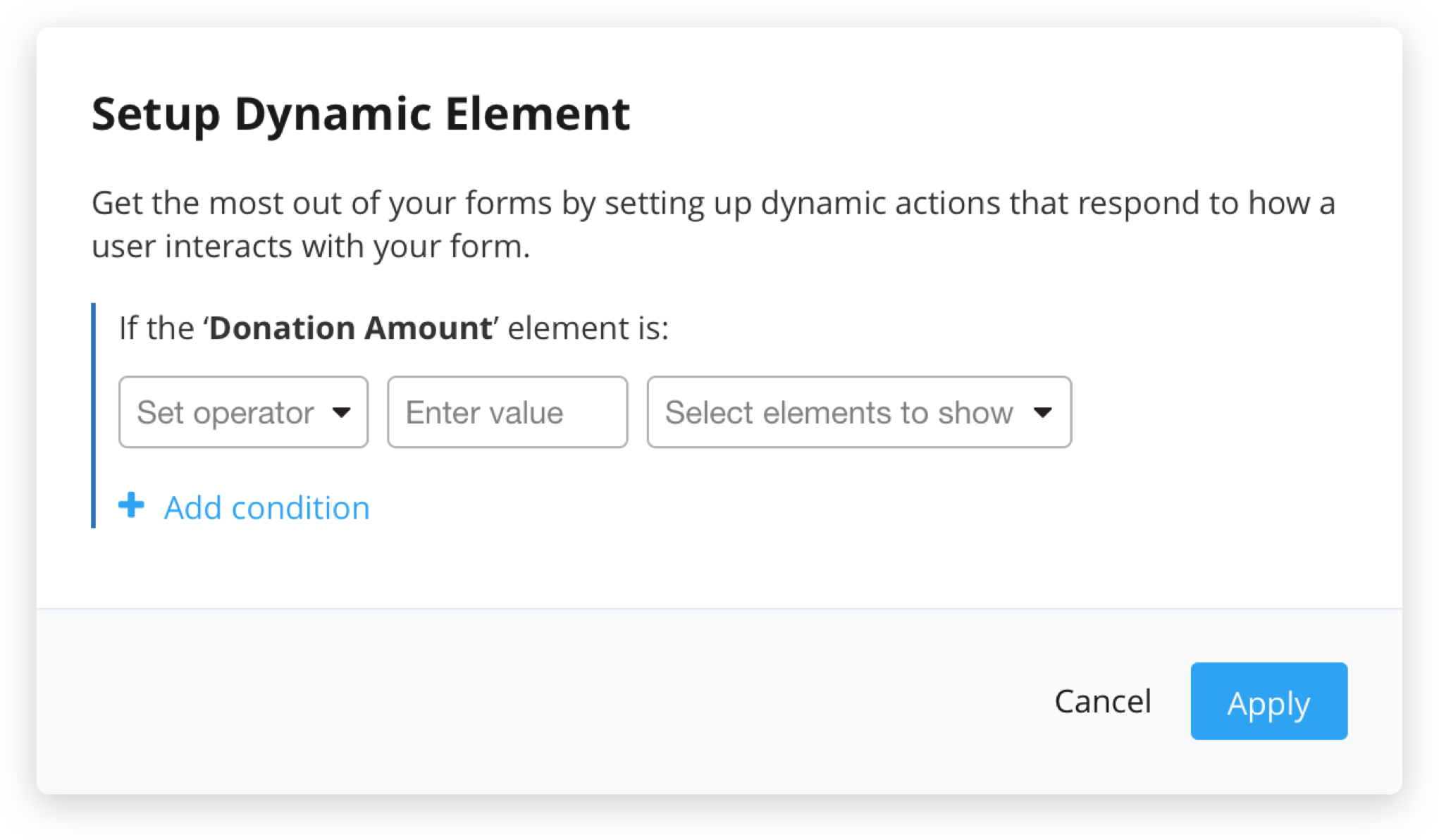
Design seems to be in the way
Hierarchy needs work
Does not align with existing design patterns
Can’t undo action
Inputs dont feel like inputs, easily missed
Verbiage not working, users may not understand
Not at all familiar
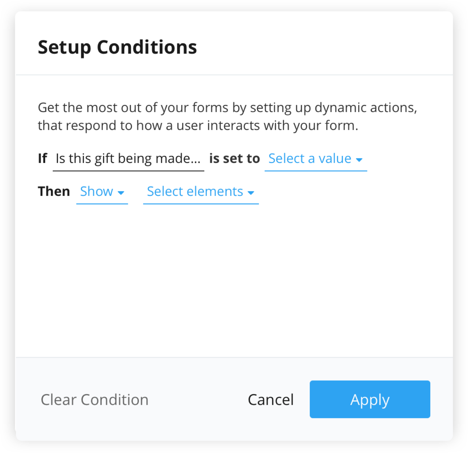
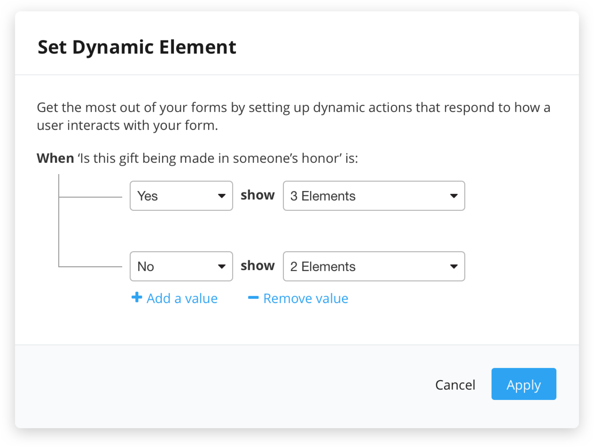
Add / remove positioning feels uneven and awkward
Copy needs to be more informative and guiding
UI not quite right, clunky
A bit boring :(((
What We Shipped
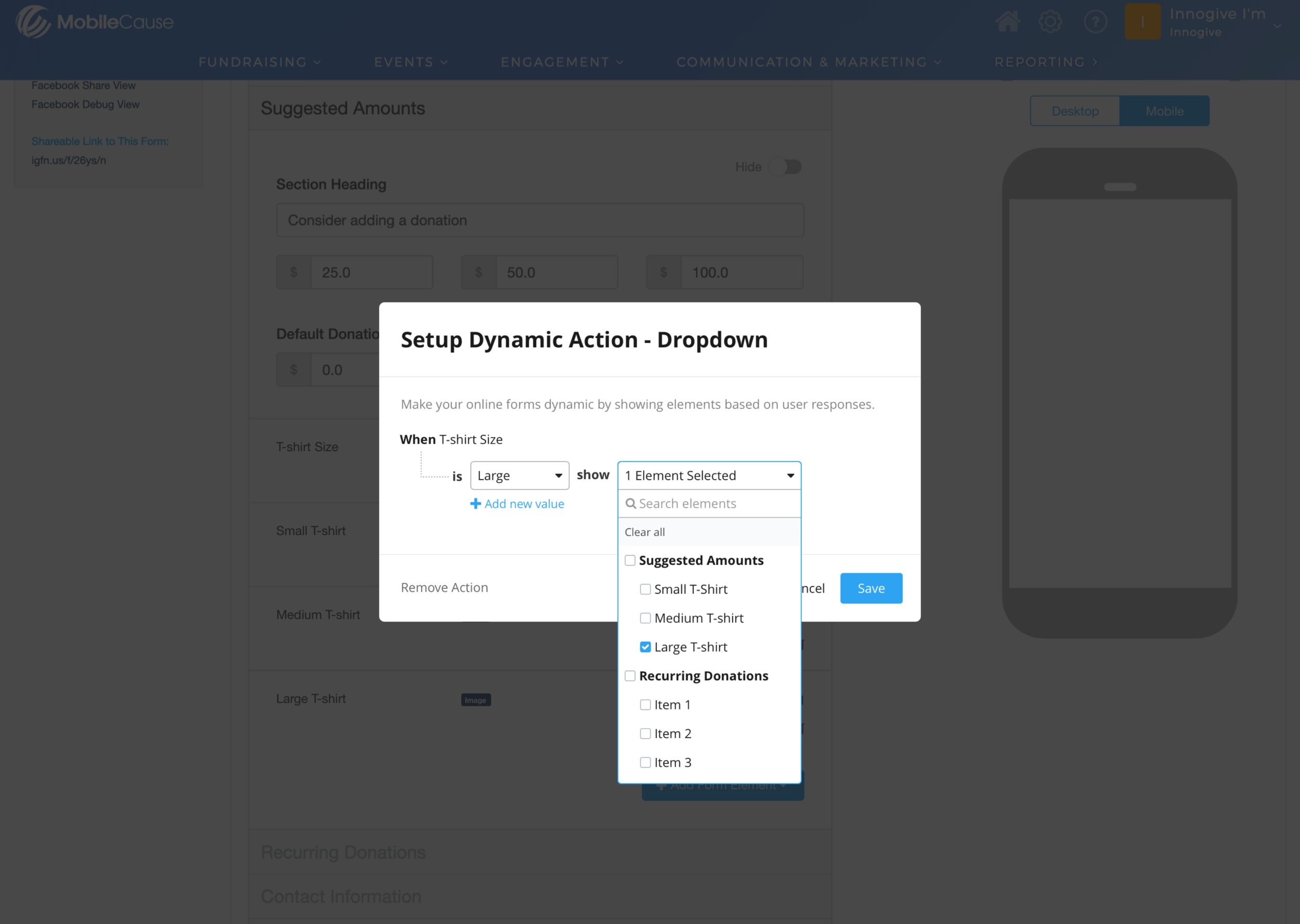
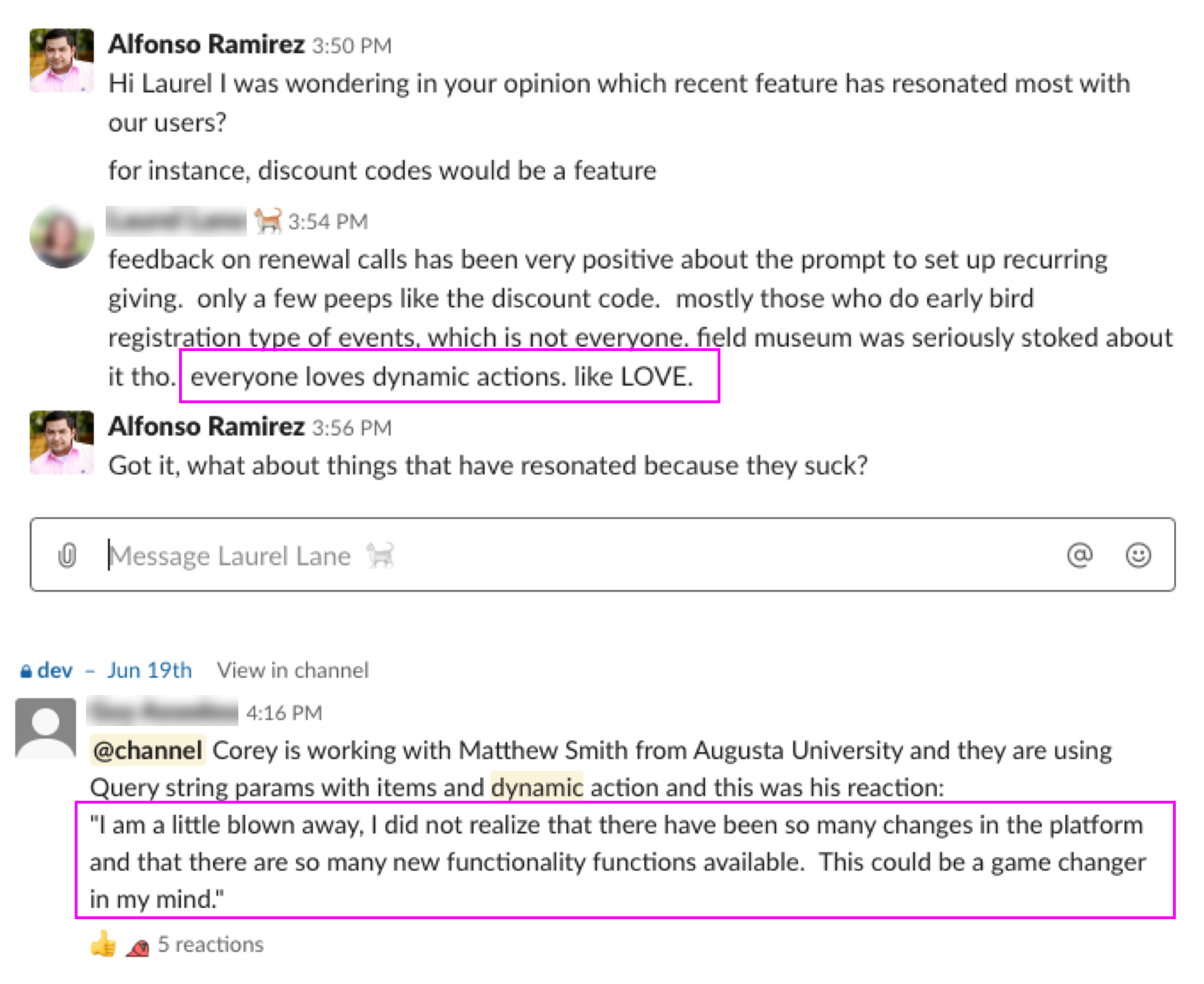
The initial response from internal teams was extremely positive, and quite frankly one of the more humbling experiences of my professional career. The support and appreciation from internal teams was palpable. However, the response from the users is what resonated the most with me…
More Case Studies